Color Consultation
Table Of Contents
At Aaron Windows, we offer a specialized service known as "Color Consultation" to assist our customers in choosing the perfect colour for their windows. Our expert team of designers will work closely with each client to understand their interior design goals and preferences. Whether it's selecting a bold color to make a statement or choosing a subtle hue to blend in seamlessly, we have the expertise to guide you every step of the way. With our Color Consultation service, we ensure that your windows not only enhance the aesthetics of your home but also reflect your unique style and personality. Trust Aaron Windows to bring your vision to life with our personalized colour advice and recommendations.
Benefits of Professional Colour Consultation
Professional colour consultation offers a myriad of advantages for homeowners and businesses alike. By enlisting the expertise of a colour consultant, individuals can ensure that their spaces are transformed into visually appealing and harmonious environments. These experts possess a keen eye for colour and design trends, allowing them to provide invaluable guidance on selecting the perfect shades and combinations that best suit the client's preferences and the space's requirements.
One of the key benefits of professional colour consultation is the ability to enhance the overall property value. By choosing the right colours and schemes, a space can be elevated to new levels of sophistication and style, ultimately increasing its market appeal and resale value. Whether it's a residential property looking for a fresh new look or a commercial space aiming to attract more customers, the expertise of a professional colour consultant can make a significant difference in achieving the desired aesthetic outcome.
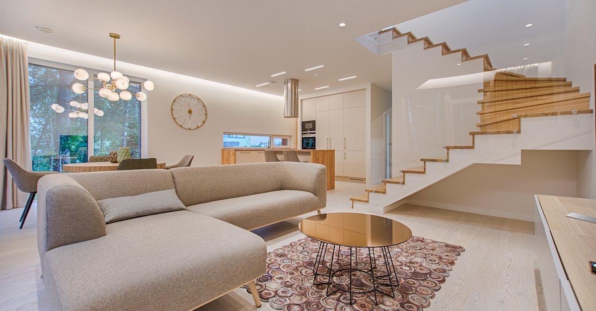
Enhancing Property Value
Enhancing the property value of a home can be a straightforward and cost-effective process with the help of a professional colour consultation. By selecting the right hues and tones for both the interior and exterior of a house, you can significantly increase its visual appeal and overall market worth. Potential buyers are often drawn to properties that are well-maintained and thoughtfully designed, making colour consultation a valuable investment for homeowners looking to boost their resale value.
In today's competitive real estate market, having a property that stands out for all the right reasons is essential. Professional colour consultation can provide expert guidance on choosing colours that not only enhance the aesthetics of a home but also create a cohesive and inviting atmosphere. With the right colour choices, you can create a welcoming environment that appeals to a broader range of potential buyers, ultimately leading to a faster sale and a higher selling price.
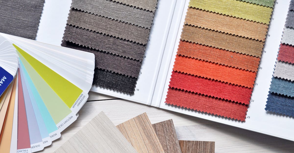
Colour Harmonization Techniques
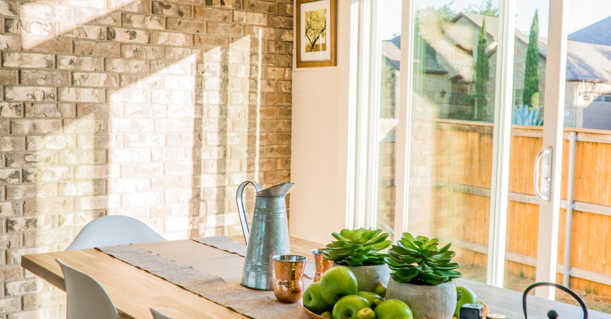
When it comes to color harmonization techniques, one effective method is mixing warm and cool tones together. This creates a balanced and visually appealing space by incorporating elements that evoke warmth and coziness, as well as cool and calming vibes. The juxtaposition of warm and cool tones can add depth and dimension to a room, making it feel more inviting and comfortable for inhabitants and visitors alike. By strategically blending warm and cool colors, you can transform a space into a harmonious oasis that caters to various moods and preferences.
Another key approach to color harmonization is utilizing the principles of the color wheel. Understanding how different colors interact with one another can help you create a cohesive and balanced color scheme for any room. Whether you opt for analogous colors that are adjacent on the color wheel for a more understated and serene look, or complementary colors that sit opposite each other for a bolder and more dynamic effect, the color wheel can serve as your guide in achieving the perfect color harmony. By incorporating these fundamental color principles into your design process, you can elevate the overall aesthetic appeal of your space and create a harmonious environment that speaks to your personal style.
Mixing Warm and Cool Tones
Choosing a colour scheme for your space involves considering the tones that will complement each other harmoniously. When mixing warm and cool tones, it is important to strike the right balance to achieve a visually appealing result. Warm tones like red, orange, and yellow can add a sense of energy and coziness to a room, while cool tones such as blue, green, and purple evoke calmness and sophistication.
To harmonize warm and cool tones effectively, consider using neutral shades as a bridge between the two. Neutrals like beige, grey, and taupe can help blend warm and cool colours seamlessly, creating a cohesive look throughout the space. Additionally, incorporating textures and patterns in varying tones can add depth and dimension to the room, enhancing the overall aesthetic appeal.
Utilizing Colour Wheel Principles
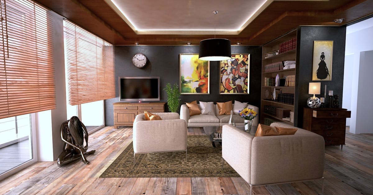
Understanding the colour wheel principles is essential for creating harmonious colour schemes in interior design. The colour wheel consists of primary colours (red, blue, yellow), secondary colours (orange, green, purple), and tertiary colours (red-orange, yellow-green, blue-violet). By utilizing this tool, interior designers can effectively combine colours to achieve the desired mood or atmosphere in a space.
One common technique is using analogous colours, which are located next to each other on the colour wheel. This creates a harmonious and cohesive look, perfect for creating a sense of unity in a room. On the other hand, complementary colours are located directly opposite each other on the colour wheel and when used together, they create a bold and dynamic contrast. Mastering the principles of the colour wheel empowers designers to play with different combinations to bring life and energy to any interior space.
Analogous vs. Complementary Colour Schemes
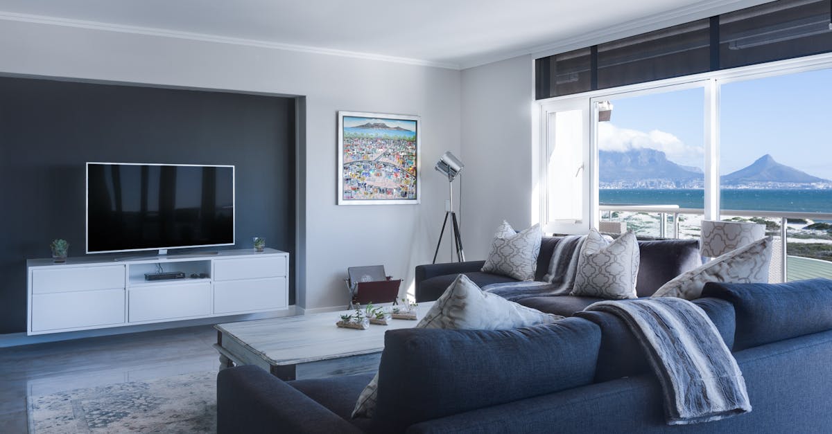
When it comes to choosing the right colours for your space, understanding the difference between analogous and complementary colour schemes is crucial. Analogous colours are those that are next to each other on the colour wheel, such as blue, blue-green, and green. This scheme creates a harmonious and calming effect, perfect for creating a cohesive look in a room.
On the other hand, complementary colours are found opposite each other on the colour wheel, like blue and orange or red and green. Using complementary colours can create a dynamic and vibrant contrast in a space, adding visual interest and energy. By incorporating both analogous and complementary colours in your design, you can achieve a balanced and visually pleasing environment that reflects your style and personality.
FAQS
What is a professional colour consultation?
A professional colour consultation is a service provided by expert colour consultants to help clients choose the best colour schemes for their spaces based on their preferences, style, and the latest trends.
How can a professional colour consultation benefit me?
A professional colour consultation can benefit you by enhancing the overall aesthetic appeal of your space, increasing its property value, creating a harmonious atmosphere, and reflecting your personal style.
How does colour consultation enhance property value?
Colour consultation enhances property value by creating a visually appealing space that can attract potential buyers, increase the perceived value of the property, and make it stand out in the real estate market.
What are some techniques used in colour harmonization during a consultation?
Techniques used in colour harmonization include mixing warm and cool tones to create balance, utilizing colour wheel principles to create cohesive colour schemes, and choosing between analogous and complementary colour schemes for different effects.
How can I benefit from mixing warm and cool tones in my space?
Mixing warm and cool tones in your space can create a dynamic and visually pleasing environment, add depth and dimension to the space, and evoke specific moods and emotions based on the chosen colour combinations.